 Skip to content
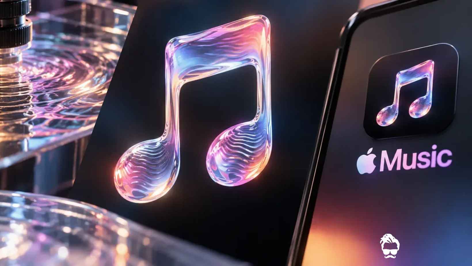
Apple Music has unveiled a new brand identity that puts sound at the centre of its visual design. Announced on October 21, 2026, the refresh introduces a redesigned logo, a new wordmark and a distinctive audio signature.
What makes the project unusual is how the visuals were created. Rather than relying entirely on computer-generated graphics, the creative team captured real patterns produced when sound vibrations travelled through mineral oil.
Named “Made by Sound,” the project aims to transform music from something people hear into something they can also see. The result connects Apple Music’s visual identity directly to the physical behaviour of sound.
The refreshed branding is being introduced across Apple Music’s original content and event programming, with further expansion planned across marketing, products and other brand experiences.
How Was the New Apple Music Logo Created?
The creative project involved music producer Fred again.. and his collaborators at NEST Acoustics. The team developed a specially composed musical sequence and divided it into individual notes to control how the sound interacted with the physical setup.
The process involved several steps:
- Creating the musical composition: The team prepared a specific sequence of notes to generate controlled sound patterns.
- Turning sound into vibrations: A device called a transducer converted audio signals into physical vibrations.
- Generating waves in mineral oil: The vibrations created ripples across the surface of mineral oil held in a shallow container.
- Shaping the visual patterns: Acrylic pieces shaped around Apple Music’s musical note and wordmark interacted with the light reflecting from the moving surface.
- Recording the results: Cameras captured the shifting reflections and wave patterns, which were then used to develop the final visual identity.
The result was a visual treatment rooted in real-world physical effects rather than a purely digital simulation.
Why Did the Design Process Take Several Months?
Creating a recognisable logo from moving liquid and sound required considerable experimentation. The team needed to find the right balance between musical frequencies, the number of notes and the resulting wave patterns.
Too many notes or frequencies that were too high could create excessive movement in the oil, making the logo difficult to distinguish. The team therefore had to fine-tune the composition and physical setup to produce clear, visually appealing patterns.
This process demonstrates how sound, light and material surfaces can work together to create a distinctive brand experience.
Apple Music Gets a New Wordmark and App Icon
The redesign goes beyond the familiar musical note symbol. Apple Music has also updated the way its name appears across its branding.
Key changes include:
- Redesigned wordmark: A customised typeface featuring thicker, rounded letterforms gives the brand name a refreshed appearance.
- Updated typography: The word “Music” is presented in lowercase lettering as part of the new visual treatment.
- Black-and-white app icon: The app icon moves away from the previously associated red look towards a monochrome design.
- New audio signature: A short musical identity complements the visual branding and gives the brand another recognisable element.
Together, these changes are intended to create a more consistent identity across visual and audio touchpoints.
How Apple’s Liquid Glass Design Influenced the New Identity
The new Apple Music branding also reflects elements of Apple’s Liquid Glass design language, which emphasises transparency, light reflections and fluid visual effects.
The shifting reflections produced by sound waves in mineral oil naturally complement this approach. The combination of light, movement and glass-like surfaces gives the new identity a dynamic quality while keeping music itself at the centre of the concept.
Rather than treating the logo as a static graphic, the project presents it as the result of a physical interaction between sound, light and material.
When Will the New Apple Music Branding Appear?
Apple Music publicly introduced the new identity on October 21, 2026. The refreshed visuals are being incorporated into the service’s original content and event programming, with wider use planned across marketing, products and other experiences.
The rollout means users may encounter the new branding across different parts of the Apple Music experience as the updated identity expands.
What Makes the Apple Music Rebrand Different?
Many technology brands refresh their logos using digital illustrations, typography changes or animated effects. Apple Music’s “Made by Sound” project takes a different approach by using real sound-driven physical patterns as the basis for its visual identity.
This makes the concept closely connected to the service’s core purpose: music.
The redesigned logo, wordmark and audio signature work together to create a broader brand system rather than simply replacing one icon with another.
Final Verdict
Apple Music’s new “Made by Sound” identity is more than a cosmetic logo update. By capturing real waves created through sound vibrations in mineral oil, the company has developed a visual concept that links its branding to the physical nature of music.
With a refreshed wordmark, a monochrome app icon and a new audio signature, the redesign gives Apple Music a more unified visual and auditory identity. Its wider rollout will determine how consistently this creative approach appears across the service.
Read in App ★ Free